Brand Identity + Word Crafting + Collateral + Website Design
PIE&G Connect
Presque Isle Electric Cooperative (PIE&G) has been in Northeast Michigan since September 1937. It was the first cooperative in the state, bringing electricity to 82 farm homes just in time for Christmas. PIE&G Connect is a sub-brand offering fiber internet services to its 34,000+ members.
THE TASK…
To rebrand PIE&G Connect with a fresh and modern look while visually connecting it to the PIE&G brand. We needed to communicate to their members who value local, reliability, and integrity. We wrote a mission statement, tagline, descriptor, and belief statements to round out the personality of the brand. We determined that the brand voice should be supportive, helpful, dependable, confident, straightforward, honest, local & down-to- earth.
SCOPE OF WORK
+BRAND STRATEGY
+MISSION + BELIEF STATEMENTS
+TAG LINE + DESCRIPTOR
+PRIMARY LOGO
+SECONDARY LOGO
+MARK(S)
+BRAND PATTERNS
+COLOR PALETTE
+FONT PAIRINGS
+BRAND GUIDELINES
THE LOGO
The logo is a combination mark. It combines an easy-to-read, san serif, classic/modern typeface with an abstract lightning bolt. Since the lightning bolt is already incorporated, it is a visual way to connect to the overarching brand of PIE&G. It represents speed and subtly represents two “N’s” connecting, like in the word “connect.”

MARKS
We created a series of marks to fill out the brand. The first is made from the lightning bolt as an outline and is full of color. We also created a mark using the tagline shown in a circle with the bolt in the middle.


PATTERNS
Patterns add a fun element to any brand. We created patterns using the marks. These patterns can be used in multiple ways: on swag, print material, digital marketing, stickers-use them in any creative way!


MESSAGING
This brand needed some additional messaging to give it personality and depth. We wrote the tagline, descriptor, mission statement, and belief statements with the target audience in mind.


IMAGERY
Imagery is an important part of any brand. It should emote a warm, happy, reliable + down to earth feel.


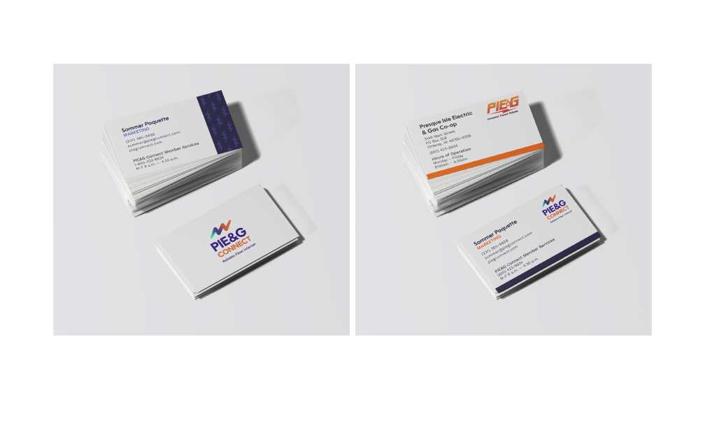
IN THE WILD
We designed the website as well as marketing collateral such as business cards, note cards, and brochures.


BRAND GUIDELINES
Brand guidelines are just that—guidelines. They are a helpful tool to ensure the brand assets are properly used going forward.